AIROPTIC
AIROPTIC
2025
Website
Branding
Figma
Webflow
Project Overview
Airoptic is a UK-based drone technology company specialising in aerial imaging and data capture. They partner with clients across sectors such as surveying, construction, and marketing to deliver precise aerial visuals and insights to support a variety of projects. A redesign of their website was required with a focus on elevating brand perception, clarifying services, connecting with clients and creating a digital experience that feels as advanced and reliable as their technology.
Visit Website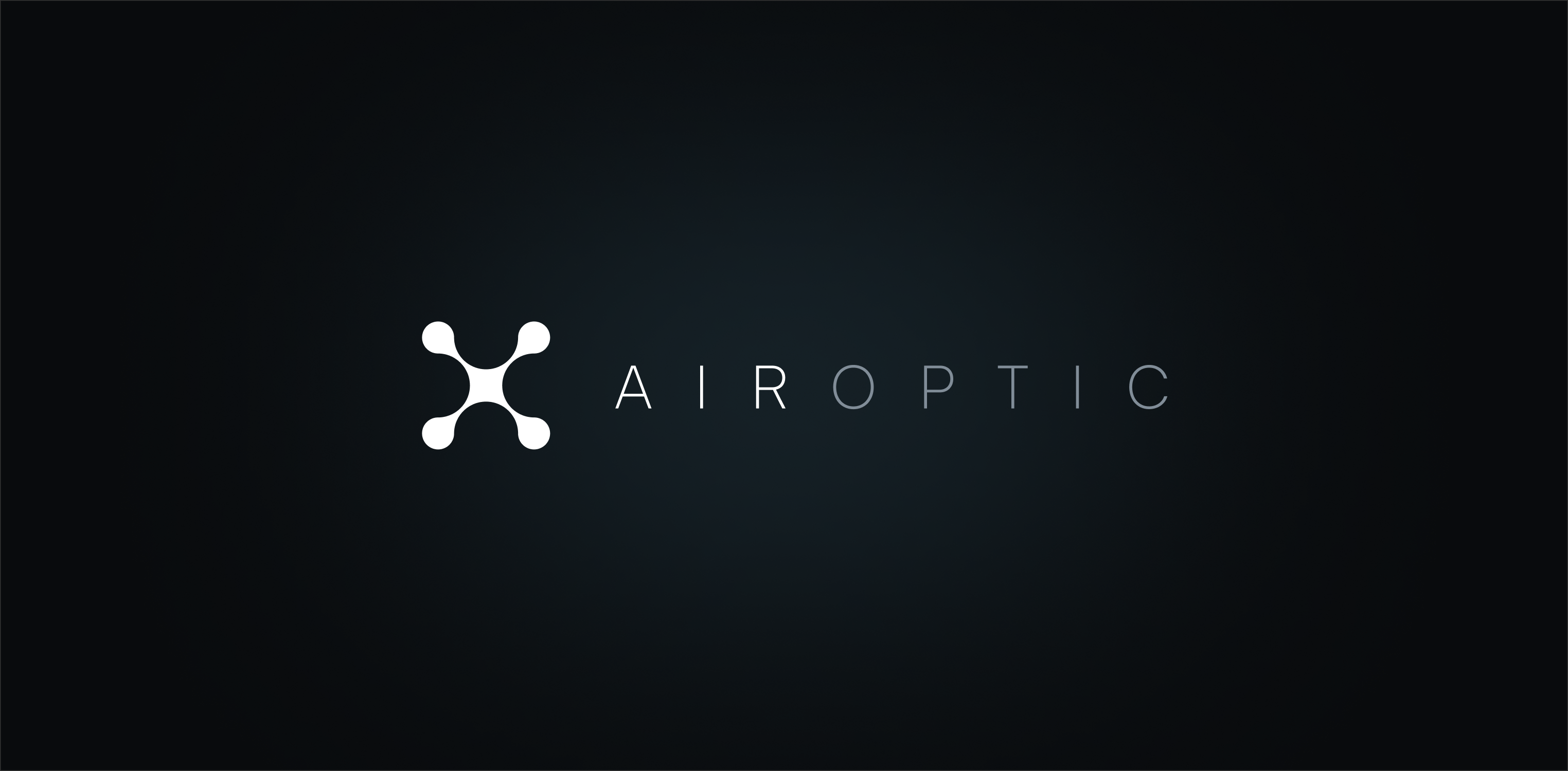
Challenges
Establish a Distinct Visual Identity
Create a bold, contemporary interface that reflects Airoptic’s precision, innovation, and technical expertise within the drone sector.
Communicate Services with Clarity
Present Airoptic’s range of capabilities, from aerial photography to data capture, through a structured and easily navigable layout.
Responsive Design
Ensure the design remains seamless, responsive, and intuitive across both desktop and mobile platforms.
Solution
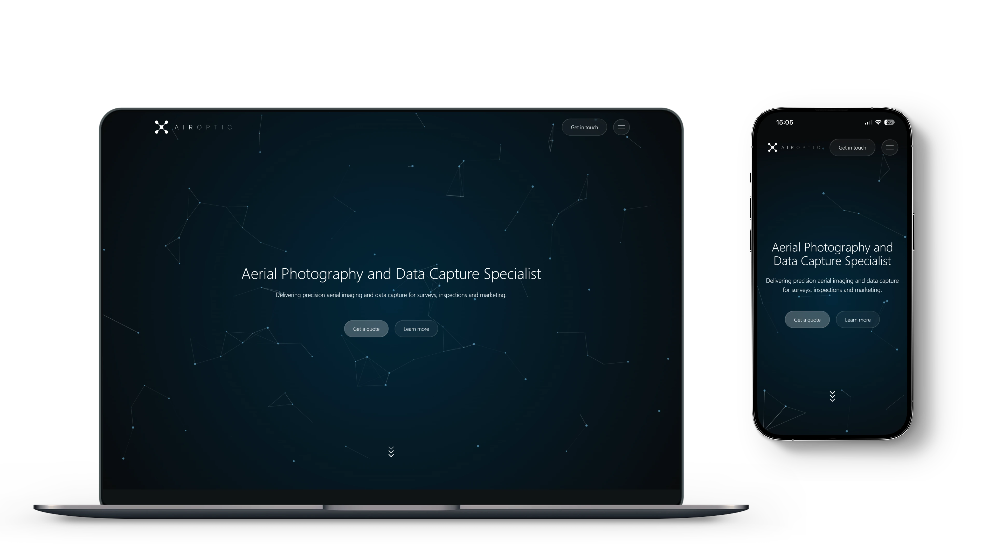
Following a complete rebrand, a bold new interface was designed and crafted in Webflow. A fixed full-screen background incorporates an interactive javascript particle system to represent the connecting and utilisation of data in an airborne design. It also creates an elevated perspective for a continuous and immersive backdrop for the website.
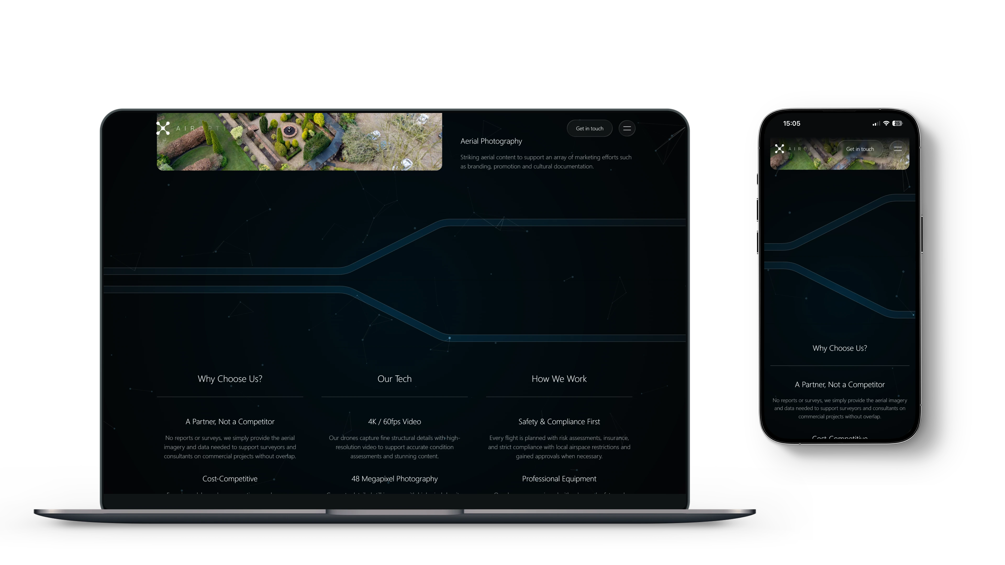
Crisp, Clean, Futuristic
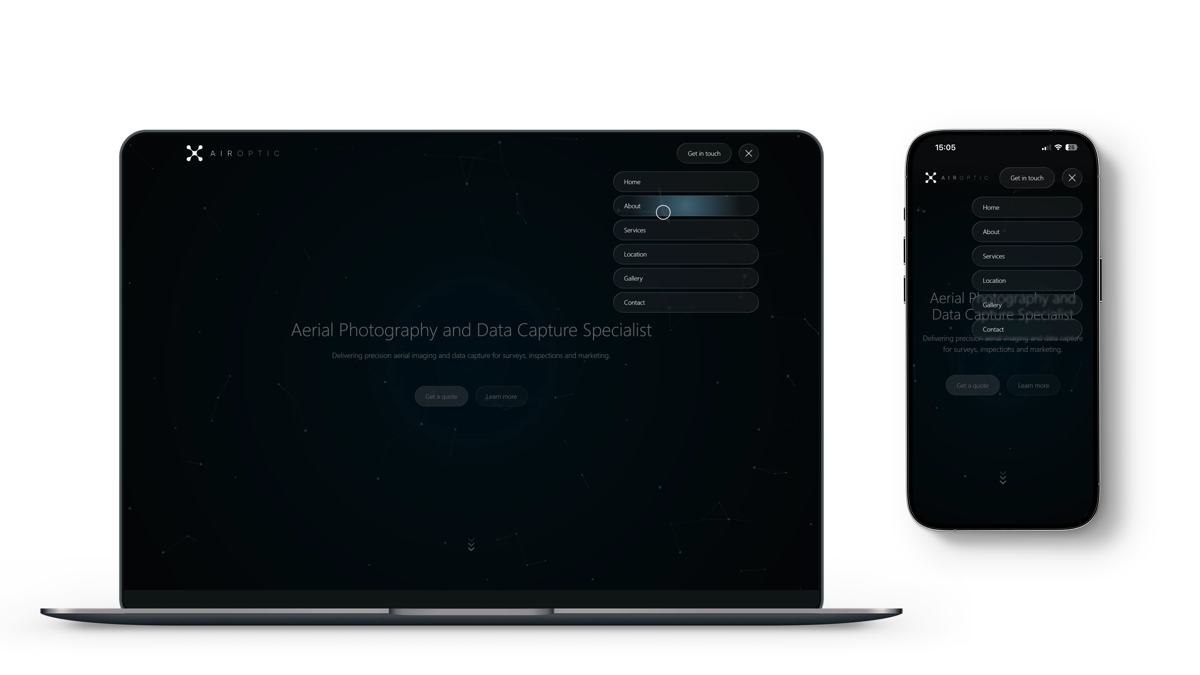
A subtle glassmorphism style was used for content navigation and buttons to softly blur and compliment the immersive background, adding a futuristic, high-tech aesthetic that reinforces the brand’s precision and innovation.

Established Credibility
The ‘Intro’ section establishes credibility through concise messaging and structured layout. Key service areas such as Aerial Data Capture and Aerial Photography are seperated, ensuring clarity while maintaining visual continuity with the immersive background. The result is a clean, confident composition that communicates expertise and professionalism without overwhelming the user.
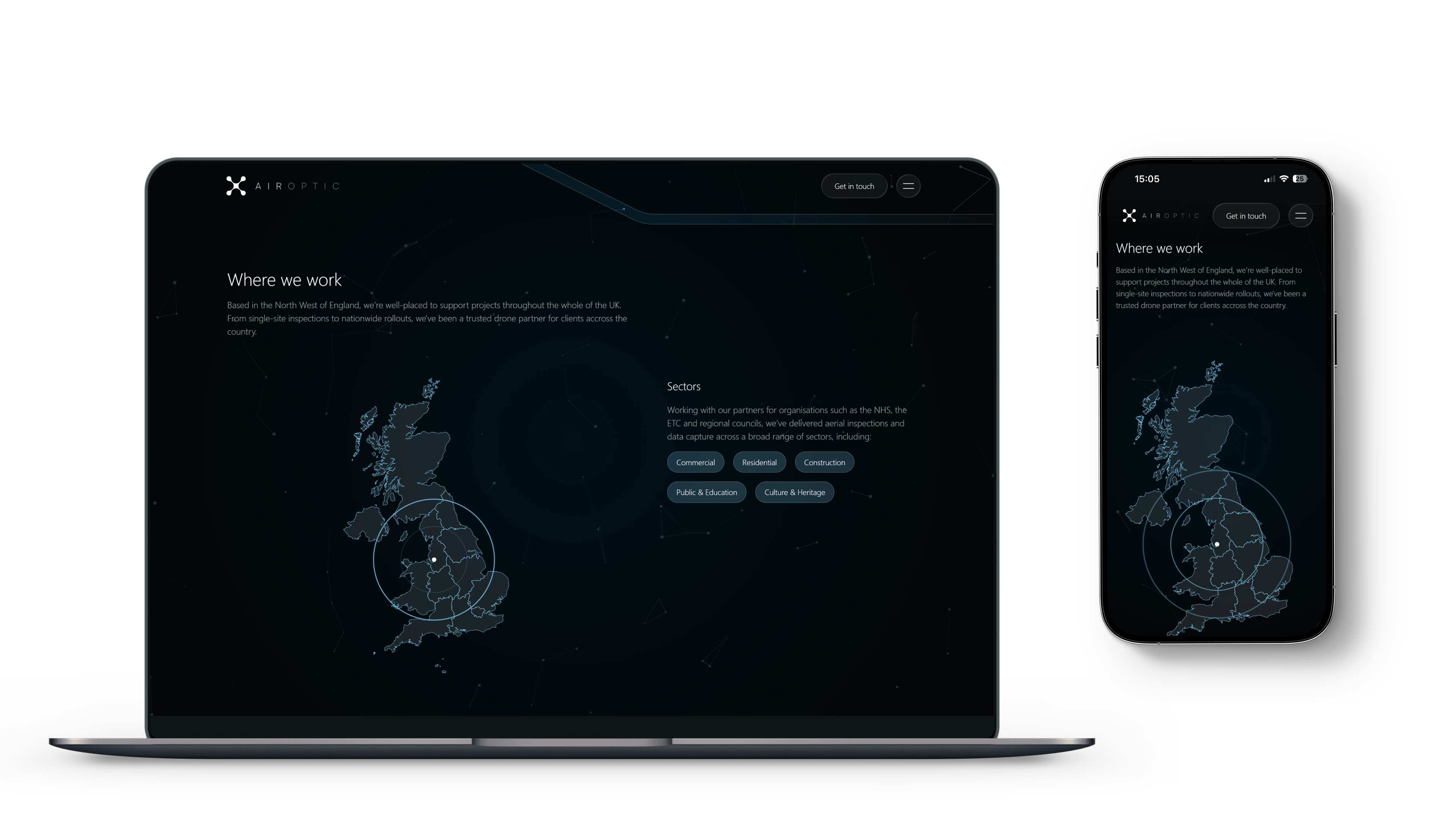
Dynamic Visuals
To convey Airoptic’s nationwide reach, a dynamic and animated map visual anchors the ‘Where We Work’ section. The transparent, softly glowing design aligns with the site’s futuristic visual language, while the glassmorphism treatment keeps focus on the content. This section reinforces trust and scale, showing that Airoptic’s precision-driven services extend across the entire UK.
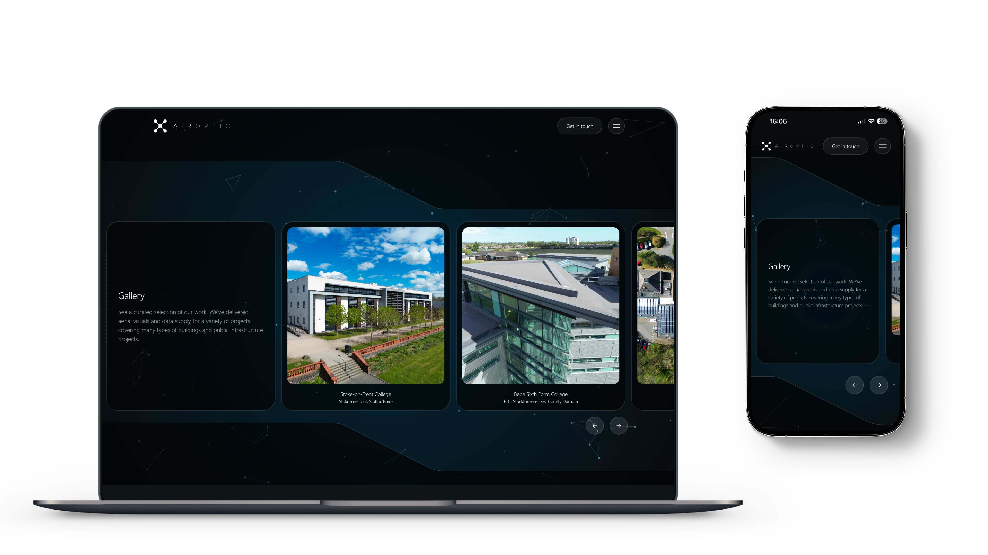
UX focused Gallery
Continuing the futuristic style, a fully responsive gallery was developed to showcase Airoptic’s work with clarity and elegance. The interactive design prioritises accessibility and ease of use across all devices, allowing users to scroll, drag, or navigate using buttons depending on their preference or device capabilities. The result is a seamless, tactile experience that highlights Airoptic’s projects through a clean, intuitive interface.


Logo
The Airoptic logo takes inspiration directly from the form and symmetry of a quad propeller drone. Four smaller circles representing the propellers, are connected by the intersecting arcs of four larger circles to create a unified, balanced shape. The geometry conveys precision and control - visual qualities designed to reflect Airoptic’s expertise in aerial imaging and data capture.
Results
The result is a cohesive, modern digital presence that reflects Airoptic’s services and innovation with a website that feels as advanced as the technology behind it.